Redesigning the Innovation Campus digital front door.
A research-led rebuild of a K–12 innovation hub's website — so students, teachers, parents and administrators could each find what they came for in under a minute, without sacrificing the identity of the place.
Three audiences. One homepage. No clear path for any of them.
The existing site tried to serve students, teachers, and administrators with a single shared navigation. Every group had to scan the same generic menu, analytics showed a 62% bounce on the landing page, and admissions staff were answering the same "where do I find…" emails every week.
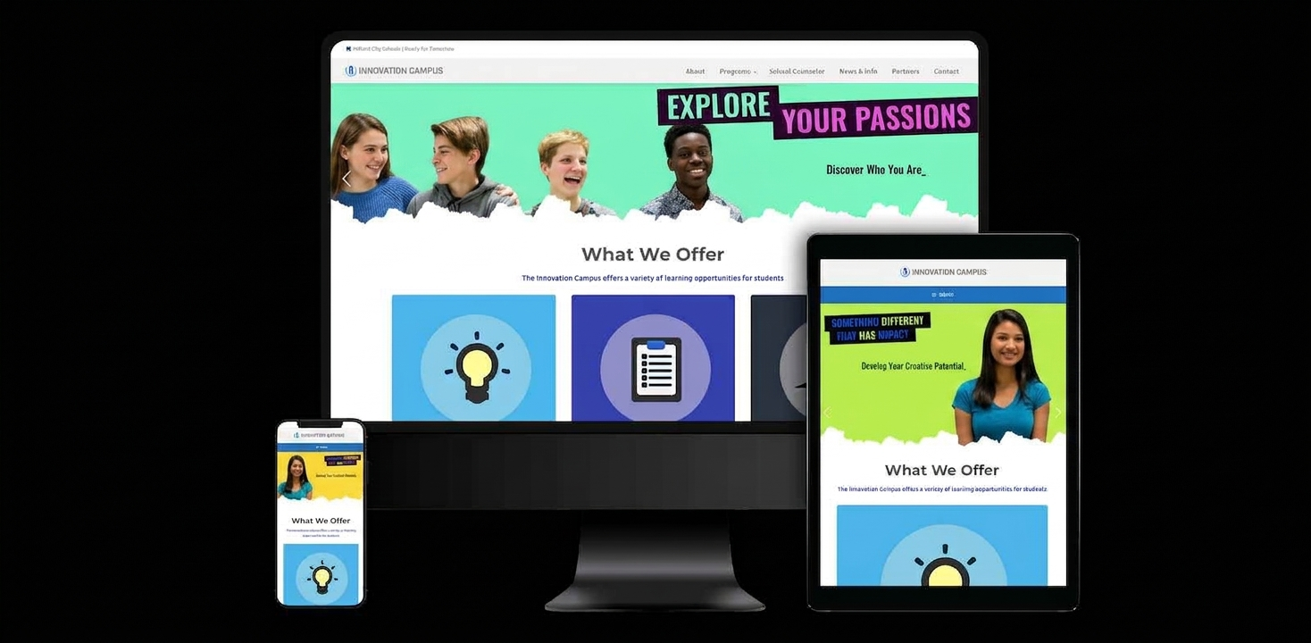
Beyond findability, the site predated modern accessibility standards — color contrast failed WCAG AA in several key areas, forms weren't keyboard-navigable, and the mobile layout broke below 375px, which happens to be the dominant screen size for our student audience.
We didn't redesign anything until we understood what each audience actually came for.
Before touching a wireframe, I ran a five-method discovery sprint: qualitative interviews, a quantitative survey, live observational usability, analytics review, and competitive analysis across peer educational institutions. The goal was to triangulate — not trust a single signal.
12 User Interviews
Students, faculty, parents, and administrators — mapping mental models and task flows.
248-Response Survey
Quantitative signal on top tasks, friction points, and device usage by audience.
Observational Usability
Ten sessions watching real users complete top tasks on the current site — without think-aloud prompts.
Analytics Review
18 months of GA behavior flows, exit pages, and internal search terms surfaced the real demand signal.
Competitive Analysis
Eight peer-institution sites scored across navigation, accessibility, and content clarity.
Accessibility Audit
Full WCAG 2.1 AA audit against the existing site — baseline for every downstream design decision.
Each audience has exactly one "primary task"
Students want course exploration. Teachers want curriculum resources. Admins want the event calendar. The homepage was forcing all three to hunt.
Mobile is not secondary — it's primary for students
73% of student survey respondents visited on mobile. The old layout broke below 375px, silently taxing the most important audience.
Trust signals mattered more than visuals
Parents didn't want hero videos. They wanted accreditation, safety protocols, and contact information within two clicks.
"The homepage should greet you like a front desk — not a lobby directory you have to decode."— Synthesis from 12 user interviews
From low-fi exploration to a shippable design system, one fidelity at a time.
Each artifact below answered a specific question. Sketches tested layout, user flows tested logic, wireframes tested hierarchy, and hi-fi mockups tested emotional tone and accessibility. Scroll the row → to walk through the fidelity progression.
Low-fi sketches
Twenty paper layouts per audience. Cheap, fast, throwaway — the point was to fail in private before committing pixels.
User flows
Three primary flows — one per audience — mapped end-to-end. Catches logic gaps before they become screens.
Wireframes
Grayscale, grid-aligned structure. Tested for hierarchy, scannability, and responsive breakpoints before any color debate.
Hi-fi mockups
Full-color comps. Type scale, imagery, and micro-copy tuned to each audience's trust signals — parents vs. students read the same page differently.
Prototype & test
Interactive prototype tested on Maze with 30 real users. Two rounds of iteration before a single line of production code was written.
Accessibility pass
Every component retested for contrast, keyboard focus, screen-reader semantics, and reflow behavior at 320px — the floor, not the ceiling.
Want to see the healthcare case study?
For a different kind of research-led redesign — native mobile for traveling clinicians — take a look at the SmileMD Provider App. Or if you have a project where this kind of cross-functional, data + research approach would help, get in touch.
Read the SmileMD case study