Employee Portal \ Hilliard City Schools

Understanding the Problem
As a UX Designer for HCSD, I understood our users (staff) needs and designed solutions around that. Redesigning the employee portal was important because it greatly improved employee user experience, which led to increased productivity and satisfaction. A poorly designed portal can be confusing and difficult to navigate, causing frustration and wasted time for employees. I addressed these issues by improving the organization and usability of the current portal, making it easier for employees to find the information they needed and perform their tasks efficiently. Additionally, I helped to ensure that the portal was accessible and inclusive for all employees, regardless of their abilities or needs. The previous portal was not responsive on smartphones, or tablets which hurt many users trying to access information away from the office. The previous portal was overflowing with copy, long hyperlinks, tiny thin fonts, and blurry image-sliced buttons.
Research
I used several research methods to improve the user experience of an employee portal. One effective method was usability testing, where actual users were asked to complete tasks on the portal while being observed and interviewed. This provided valuable insights into how the employees were currently using the portal, their pain points and frustrations, and where improvements could be made. I also found it useful to conduct user interviews, where employees were interviewed one-on-one to gather feedback and gain a deeper understanding of their needs and goals. After gathering this information I started journey mapping to create detailed profiles of the target users and understand their goals, needs, and pain points in relation to the employee portal. All these research methods helped me create a holistic understanding of the current user experience and identify areas for improvement.
Sketch
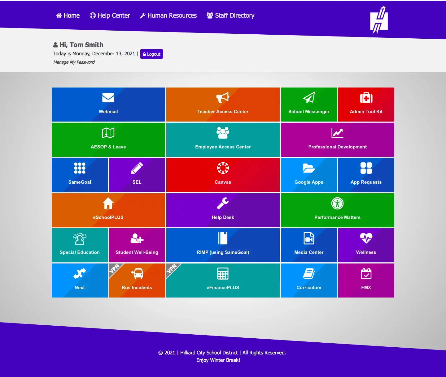
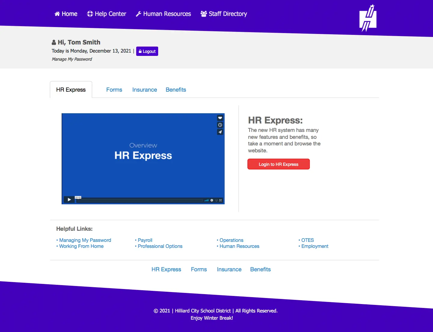
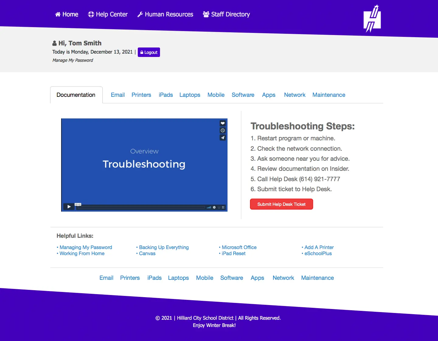
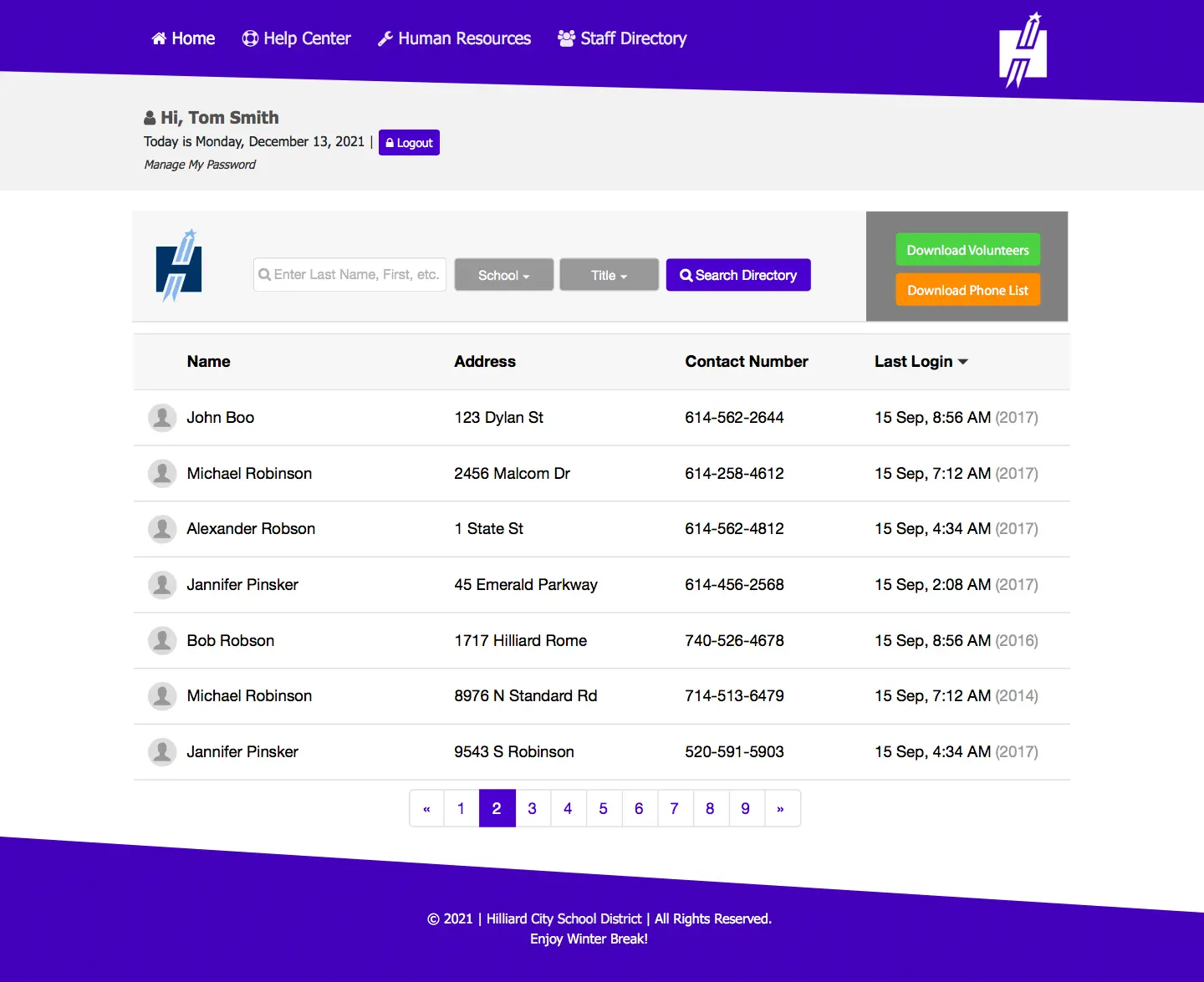
My sketches needed to include several key elements in order to improve the user experience of an employee portal. I started by clearly depicting the overall layout and organization of the portal, including the main navigation and the placement of key information and features. Then I decided to include detailed wireframes of key pages, such as the homepage, login, help, HR, and staff directory. These wireframes were labeled with specific elements, such as buttons, links, table data, forms, and how they would be used by the user. Furthermore, my sketches included notes and annotations that explained the user flow and the interactions that were intended on each page.
Design
I made several design decisions to improve the user experience of the employee portal. One of the main decisions was to simplify the navigation and organization of the portal. I achieved this by consolidating the number of main navigation items and grouping related information and features together. This made it easier for employees to find what they needed and reduced the time spent searching for information. Another design decision I made was to improve the usability of the portal by using clear and consistent design elements throughout the portal. This included using a standard layout for all pages, using consistent typography and color schemes, and providing clear visual cues to indicate the different types of information and actions available. I also made sure the portal was responsive and accessible so that it could be used on any device, regardless of the employee's abilities. I also focused on the user flow and interactions, by creating detailed wireframes and user journey maps. This helped me to understand how employees were currently using the portal, and identify areas where improvements could be made. This also helped me to design a user-centered experience so that the interactions with the portal were intuitive and easy for the employees to perform their tasks. Overall, the design decisions I made helped to create a more efficient and user-friendly employee portal, which in turn led to increased productivity and satisfaction among employees.
Implement
After launching the improved user experience of the employee portal, I conducted several follow-up activities to ensure its success. One of the first things I did was to gather feedback from employees who were using the new portal. I conducted user interviews to understand how well the changes were working and what areas still need improvement. I also monitored the portal's analytics to track the usage and engagement of the employees. I used heat mapping which helped me to understand how employees were interacting with the portal and identify any areas where they were experiencing difficulty. Based on this feedback and analytics, I made further improvements and adjustments to the portal. I also conducted usability testing with a small group of employees to ensure that the portal was meeting their needs and was easy to use. I observed them using the portal and asked them to complete tasks while providing feedback, this helped me to identify any issues that needed to be resolved. Finally, I also provided training and support to employees to ensure that they were comfortable using the new portal and were able to take full advantage of its features. All these actions helped me to ensure that the new employee portal was meeting the needs of the employees and was effectively supporting their work.
Conclusion
I concluded that the redesign was successful in increasing user engagement and satisfaction. The new layout and navigation made it easier for employees to find the information they needed. There was now a consistency with fonts, color, and brand that brought a sense of professionalism and simplification that eased the overall experience. The implementation of user feedback also contributed to the overall success of the redesign. Overall, the new employee portal received positive feedback from users, and I am confident that it will continue to improve the experience for all employees. I really enjoyed this project because I could see the impact it had in real time with the users.
View Next Case Study


